
Building a Scalable Design System
Project Overview
Role: Senior Product Designer
Platforms: Web (Desktop), iOS, Android, tvOS
Team: Solo Designer with Developer Support
Tools: Figma, Sketch, Slack
Overview
When I joined the Global TV team, design files were scattered across Sketch with no consistent structure, limited reuse, and no shared foundation across platforms. As the team transitioned to Figma, I saw an opportunity to build something that would do more than just organize files — a scalable system that would let the team move faster, ship more consistently, and reduce the friction between design and development.
I rebuilt the component library from the ground up in Figma, organizing it by platform, introducing Auto Layout and component variants, and later evolving it to support Variables and Design Tokens. The result was a single source of truth that reduced design iteration time by approximately 30–40% and contributed to a ~25% reduction in UI-related QA issues — meaning fewer bugs, less rework, and cleaner handoffs for the engineering team.
The Problem
The existing Sketch-based design system had grown inconsistently as the product expanded across desktop, mobile, and TV platforms. Components weren’t reusable across platforms, naming was inconsistent, and there was no shared token layer — every update required changes in multiple places.
This created real friction: design iterations took longer than they should, developer handoff required extra back-and-forth, and QA regularly surfaced UI inconsistencies that traced back to the design files.
With the team moving to Figma, there was a clear opportunity to reset and build something that would scale — not just for the current product, but for any future features built on top of it.
My Role
As the sole designer responsible for the Global TV experience across web, iOS, Android, and tvOS, I owned the design system end-to-end — from the initial audit through ongoing maintenance and a later update that introduced Variables and Tokens.
Key contributions:
- Migrated and restructured the component library from Sketch to Figma
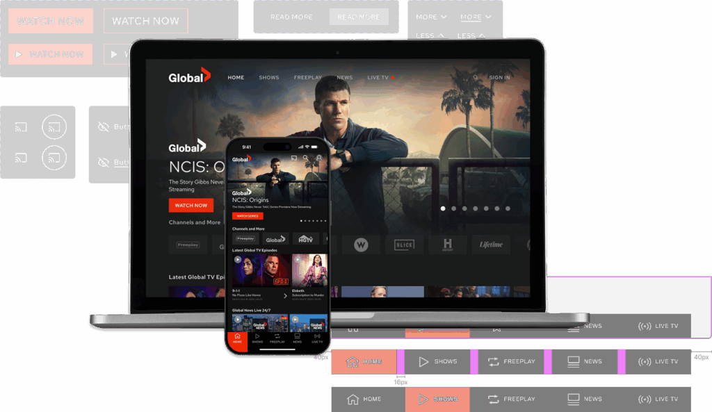
- Organized libraries by platform (Mobile, Web, tvOS) with shared foundations
- Built platform-specific variants while maintaining a consistent visual language
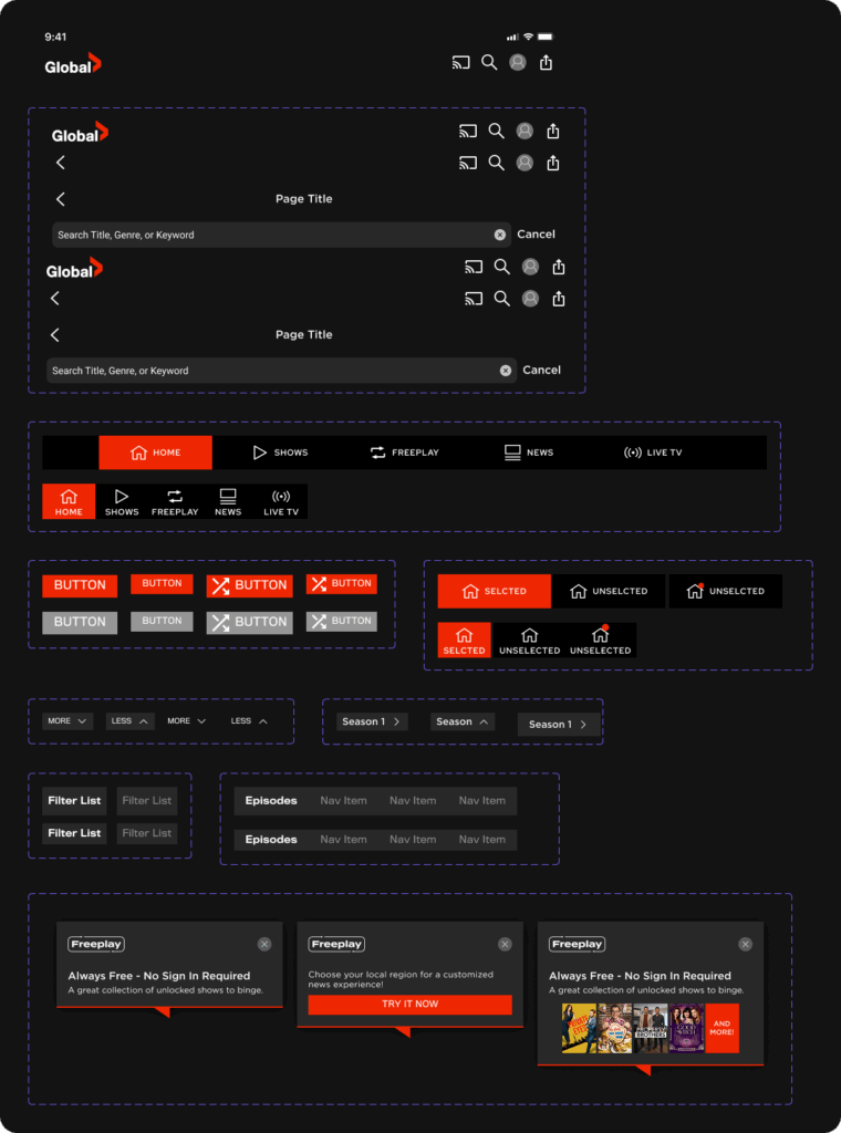
- Introduced Auto Layout and component properties to reduce duplication and speed up layout work
- Consulted with developers to ensure component naming and behaviour matched real implementation
- Updated the system to support Figma Variables and Design Tokens, future-proofing it against product evolution
Process & Exploration
System Audit & Platform Mapping
I started by importing existing Sketch files into Figma and doing a component-by-component audit. Rather than rebuilding from scratch, I identified what could be reused, what needed to be normalized, and what was platform-specific.
iOS and Android shared a similar visual language, so those components were grouped together with variants where needed. Web had unique layout requirements, and tvOS required a separate, simplified library due to its distinct navigation model and remote-based input constraints.
This audit phase wasn’t just housekeeping — it gave me a deep understanding of the product’s existing patterns, which meant fewer questions and faster execution when new features were designed.
Collaboration & Clarification
While I owned the system independently, I worked closely with developers throughout. For complex or unfamiliar components, I consulted engineers to understand how things were actually built — ensuring that component naming, states, and behaviour reflected real-world implementation rather than design assumptions. I also connected with the previous designer to clarify legacy patterns before changing them.
This cross-functional alignment made a direct difference: handoff conversations became shorter, and implementation surprises decreased.
Design Decisions
Library Organisation
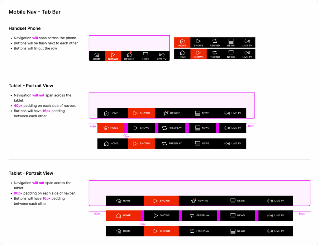
- Separate libraries for Web, Mobile, and tvOS — allowing platform-specific work without cluttering shared foundations
- Shared base components with platform-appropriate variants, minimizing duplication
- Developer-friendly naming conventions to reduce ambiguity during handoff
Leveraging Figma’s capabilities
- Auto Layout and component variants to reduce redundancy and speed up layout work
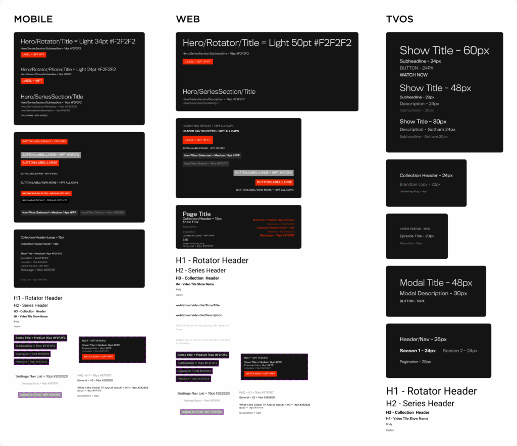
- A single master file housing all core foundations: colour, typography, spacing, and iconography
Tokens & Variables (later evolution)
When Figma released Variables support, I revisited the system to modernize it:
- Colour variables for light/dark and platform-specific themes
- Typography and spacing scales
- Component states: default, hover, active, disabled
This update meant that a single token change could propagate consistently across platforms — eliminating a class of errors that previously had to be caught in QA.
Outcome
The impact was measurable in two ways:
Speed: Design iteration time dropped by approximately 30–40%. New mockups could be assembled from the library in a fraction of the time, and updates to existing components propagated automatically rather than requiring manual fixes across files.
Quality: The shared component library and documented specifications contributed to a ~25% reduction in UI-related QA issues — meaning engineering spent less time flagging visual inconsistencies and more time building.
Beyond the numbers, the system changed how I worked. Design became less about redrawing layouts and more about solving problems — which is exactly where design effort should be focused.
Reflection
This project reinforced that a design system is never really “done” — it’s a living foundation that needs to evolve as the product and tools change. The decision to revisit and modernize the system with Tokens wasn’t part of the original plan, but it’s what kept the system useful and scalable over time.
If I were to extend this further, I’d prioritize in-file documentation and contribution guidelines to support team onboarding and open up the system to collaborative input as the design team grows.
This project directly reflects the kind of systems thinking needed in complex SaaS environments:
- Scalability: Built for reuse across four platforms, not just one team’s workflow
- Consistency: Token-based architecture ensures UI changes propagate correctly — reducing errors in compliance or data-sensitive interfaces
- Efficiency: Faster iteration and fewer QA cycles mean design and engineering stay aligned and move quickly
- Collaboration: Developer-informed naming and structure made handoff cleaner and reduced implementation rework