Role: Senior Product Designer Platforms: Web (Desktop, Tablet, Mobile Browser) Team: Product Owner, Co-Designers, Web Developer Tools: Figma, Slack
Overview
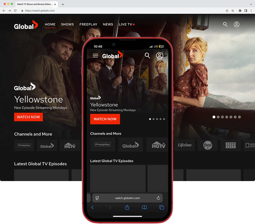
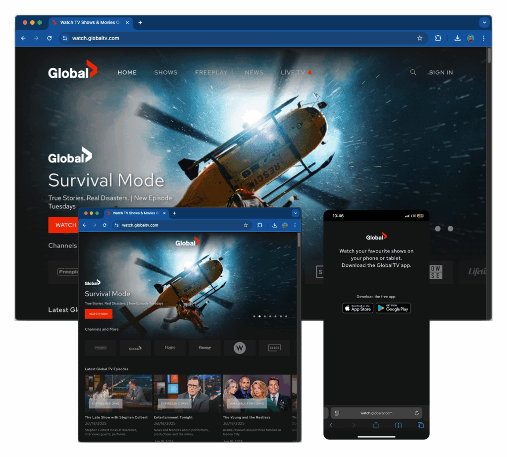
The Global TV website was completely inaccessible on mobile and tablet browsers. Users who visited from a phone were met with a full-screen prompt telling them to download the app, with no way to browse or stream content. As mobile web traffic grew, this became a meaningful gap in the product experience.
I led the responsive redesign to bring the website up to modern cross-platform standards. By adapting components from the existing mobile app design system, introducing a new drawer-style navigation, and building flexible templates in Figma with tokens and variables, I delivered a production-ready mobile web experience covering all key templates and breakpoints. The work was fully documented and added to the development backlog, ready for implementation without requiring additional design cycles.
The Problem
How might we create a mobile-first version of the Global TV web app that supports browsing and playback without requiring users to download the app?
Mobile web traffic was increasing, but the website had no answer for it. Every phone or tablet visitor hit a dead end. That represented a segment of users the platform was simply not serving, people who preferred to stream through a browser rather than install an app.
The mobile app had already been launched, so strong design foundations and components were in place. The problem was not starting from scratch. It was adapting what we had into a system that worked across all screen sizes.
My Role
I led the full responsive redesign effort, from mapping breakpoints through final documentation and developer handoff.
Key contributions:
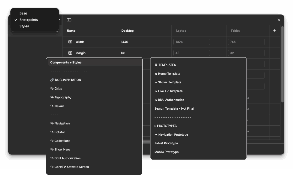
Defined breakpoints based on common device sizes across phones and tablets
Reused and adapted design system components from the mobile apps, reducing redundant work
Built responsive layouts using Auto Layout, constraints, and Figma variables
Applied design tokens for consistent spacing, typography, and colour across breakpoints
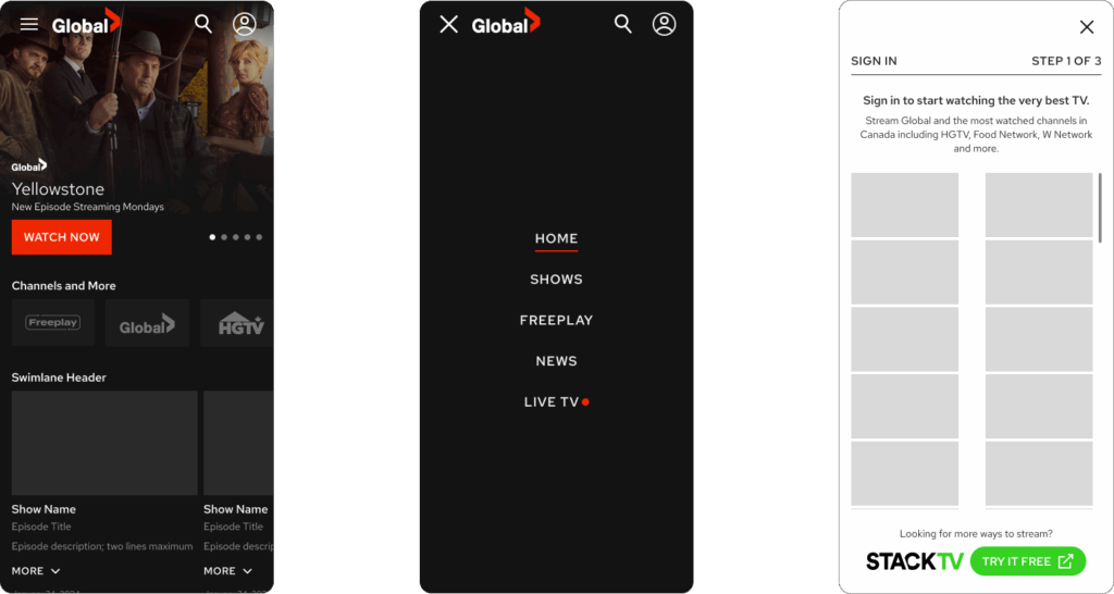
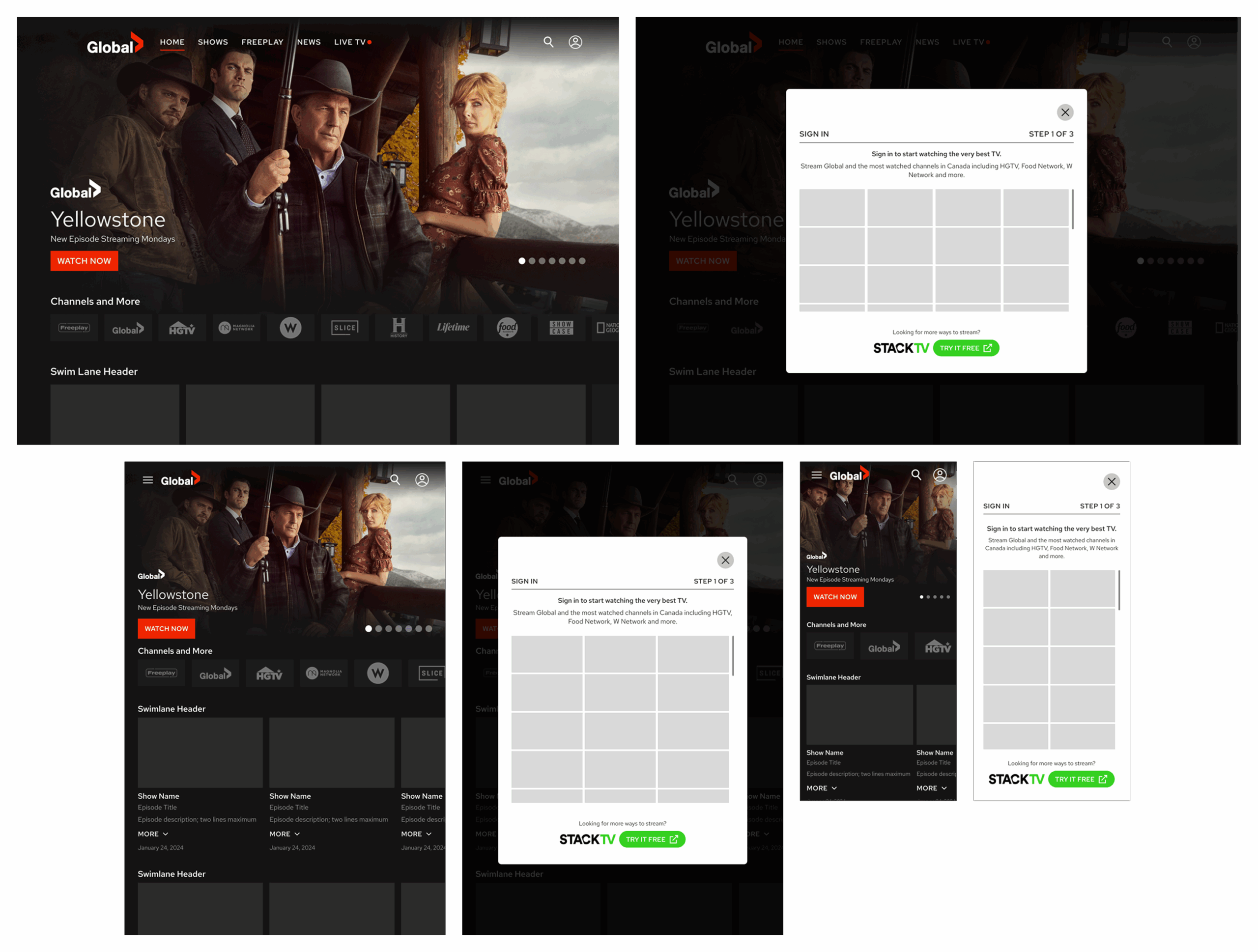
Introduced a hamburger-style drawer navigation tailored for mobile web conventions
Created complete Figma documentation covering fundamentals, components, and page templates
Collaborated with the product owner and web developer to validate technical feasibility before handoff
Process & Exploration
Ideation and Concepts
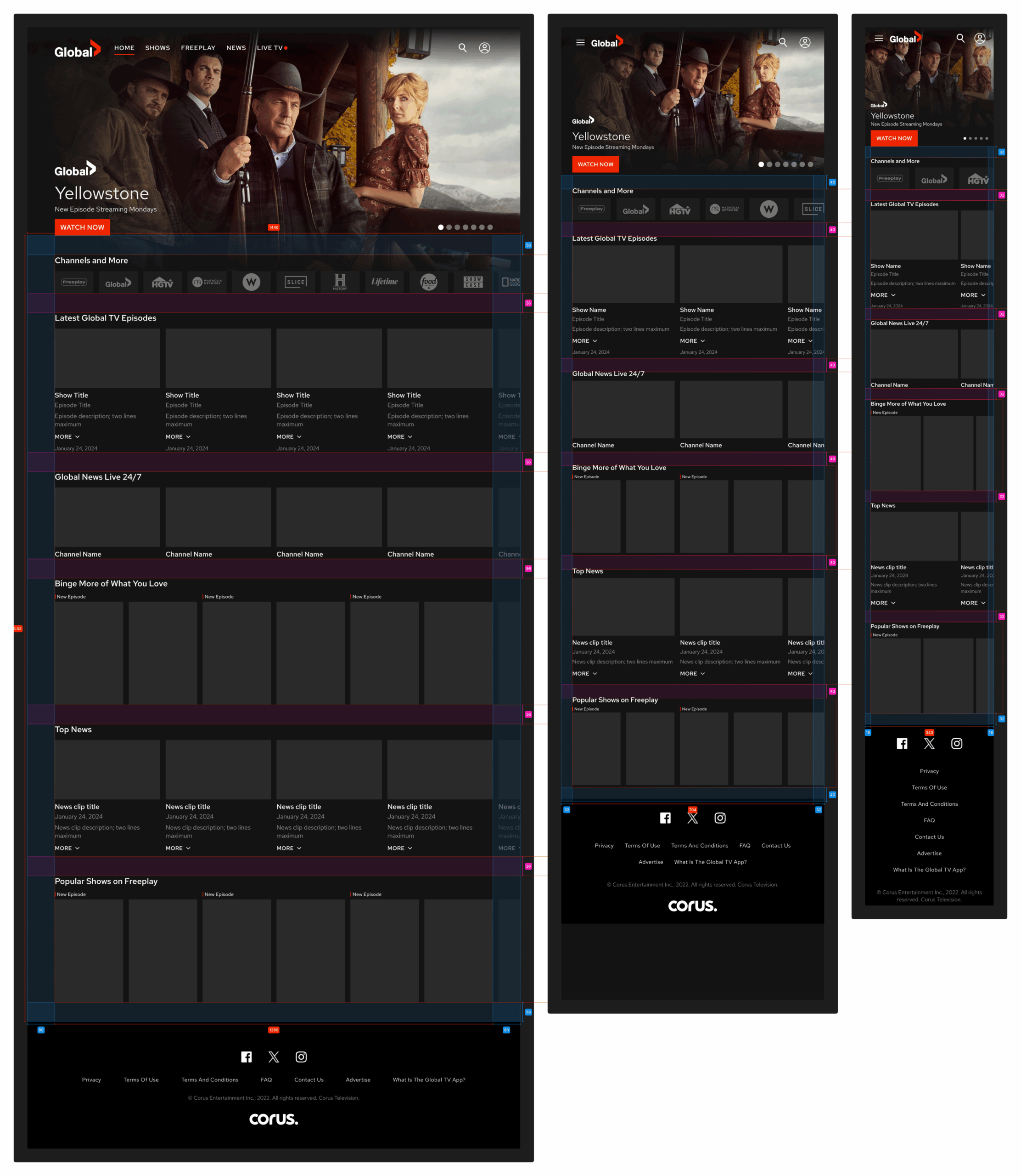
I began by mapping standard breakpoints based on common device sizes. Since the desktop site already existed, my focus was on adapting the experience for smaller screens while keeping the structure and visual language consistent with what users already knew from the app.
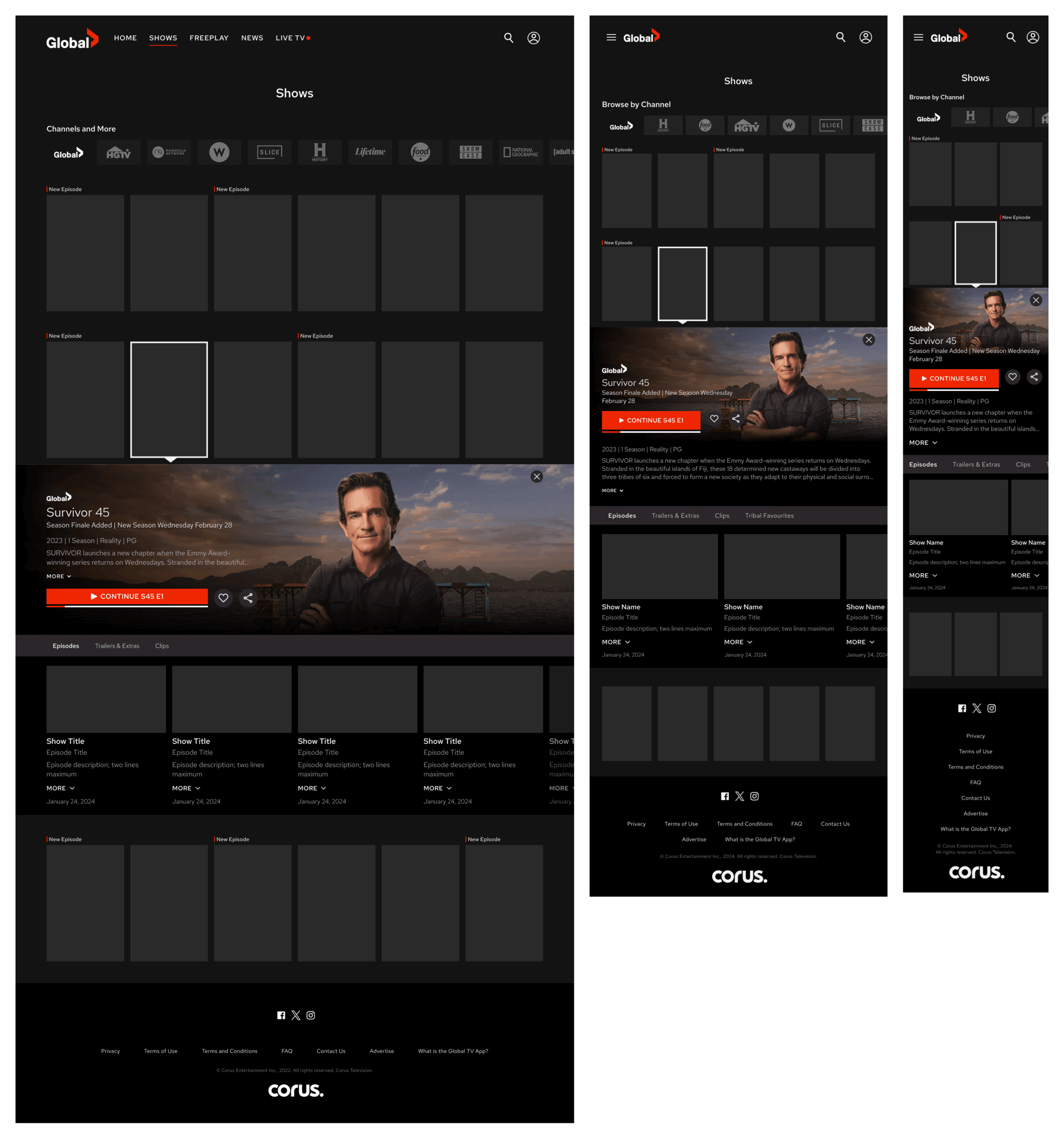
Most components were carried over from the mobile app design system, which kept the work efficient and ensured a familiar experience for users moving between platforms. The most significant new design decision was mobile navigation. The app used a tab bar, which works well in a native context but feels out of place in a browser. I replaced it with a hamburger-style drawer menu that followed expected mobile web conventions and kept screen space clear for content.
Design Decisions
Responsive behaviour built using Auto Layout, constraints, and variables, so layouts are adapted cleanly at each breakpoint without manual adjustment
Design tokens applied across colour, spacing, and type to ensure visual consistency and make future updates easier to propagate
Working prototype built to simulate navigation transitions and key page interactions for stakeholder review
Tap targets sized to meet accessibility requirements throughout
The Figma file was organized into three clear layers:
Fundamentals: Grids, typography, and colour palette
Components: Navigation, hero banners, content tiles, and carousels
Templates: Home, Shows, Live TV, and Account pages, each at phone and tablet breakpoints
Responsive Mockups of Home Screen
Responsive Mockups of Shows
Responsive Mockups for User Sign In
Outcome
The responsive redesign was delivered as a complete, developer-ready system. All templates, components, and interaction logic were fully documented in Figma and added to the development backlog, requiring no additional design work before implementation could begin.
By reusing and adapting existing mobile app components rather than designing from scratch, the project moved significantly faster than a greenfield build would have. The token-based architecture also means future visual updates can be applied once and propagate across breakpoints automatically, reducing ongoing maintenance overhead.
Reflection
This project reinforced how much leverage a well-structured design system provides. Because the mobile app components were organized and reusable, I could focus the majority of the work on responsive behaviour and the one genuinely new element, the drawer navigation, rather than rebuilding foundational UI from scratch.
Mobile-first thinking is not just about screen size. It is about understanding that users move between platforms and expect a consistent experience at every touchpoint. This project was a step toward closing that gap on the Global TV platform.