When I joined the Global TV team, design files were scattered across Sketch with no consistent structure, limited reuse, and no shared foundation across platforms. As the team transitioned to Figma, I saw an opportunity to build something that would do more than just organize files: a scalable system that would let the team move faster, ship more consistently, and reduce the friction between design and development.
I rebuilt the component library from the ground up in Figma, organizing it by platform, introducing Auto Layout and component variants, and later evolving it to support Variables and Design Tokens. The result was a single source of truth that reduced design iteration time by approximately 30–40% and contributed to a ~25% reduction in UI-related QA issues, meaning fewer bugs, less rework, and cleaner handoffs for the engineering team.
The existing Sketch-based design system had grown inconsistently as the product expanded across desktop, mobile, and TV platforms. Components weren’t reusable across platforms, naming was inconsistent, and there was no shared token layer. Every update required changes in multiple places.
This created real friction: design iterations took longer than they should, developer handoff required extra back-and-forth, and QA regularly surfaced UI inconsistencies that traced back to the design files.
With the team moving to Figma, there was a clear opportunity to reset and build something that would scale, not just for the current product, but for any future features built on top of it.
My Role
As the sole designer responsible for the Global TV experience across web, iOS, Android, and tvOS, I owned the design system end-to-end, from the initial audit through ongoing maintenance and a later update that introduced Variables and Tokens.
Key contributions:
Migrated and restructured the component library from Sketch to Figma
Organized libraries by platform (Mobile, Web, tvOS) with shared foundations
Built platform-specific variants while maintaining a consistent visual language
Introduced Auto Layout and component properties to reduce duplication and speed up layout work
Consulted with developers to ensure component naming and behaviour matched real implementation
Updated the system to support Figma Variables and Design Tokens, future-proofing it against product evolution
Process & Exploration
Research & Insights
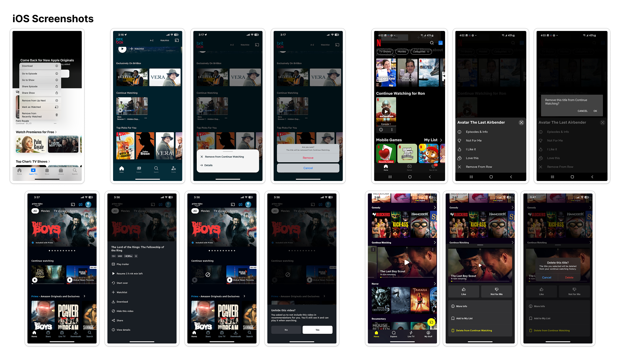
Rather than running formal user testing for a feature with well-established precedent, I started with a competitive audit — reviewing how Netflix, Disney+, and other leading platforms handle recently watched content. The pattern was consistent: bottom sheets and long-press menus were the dominant interaction models, already familiar to users across the category.
This behavioural signal gave the team confidence to move forward without extended discovery, keeping the project on track while still grounding decisions in how real users interact with similar products.
Ideation & Concepts
I explored three entry points for the action:
Inline buttons on each title card: too visually noisy, cluttering the homescreen
Long-press menus: familiar, but inconsistent with patterns elsewhere in the app
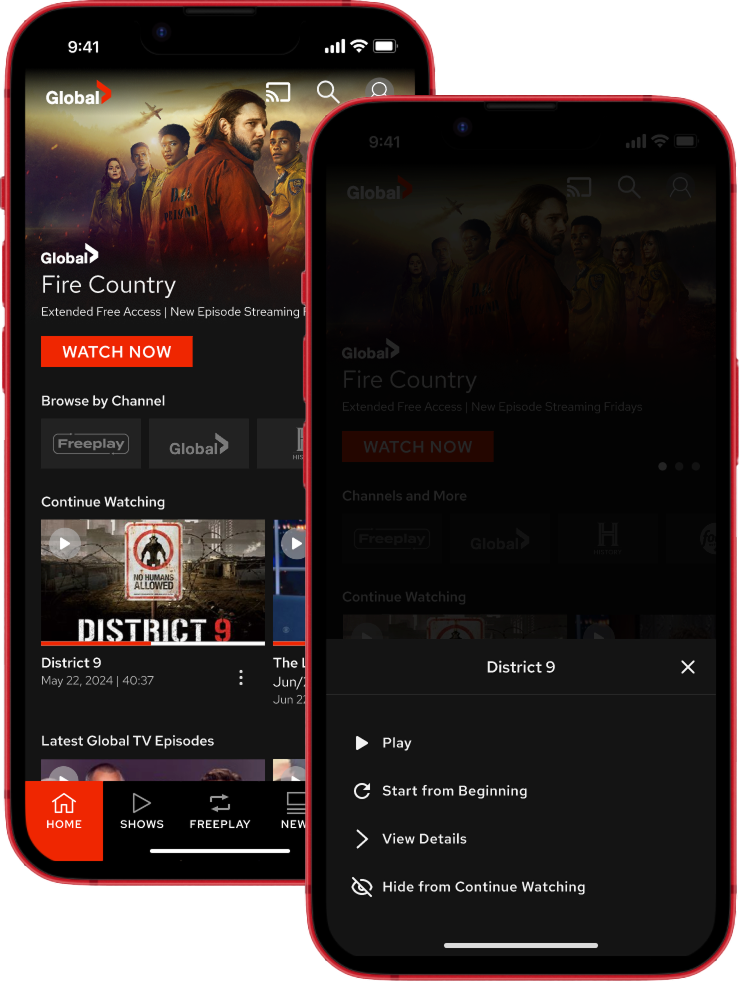
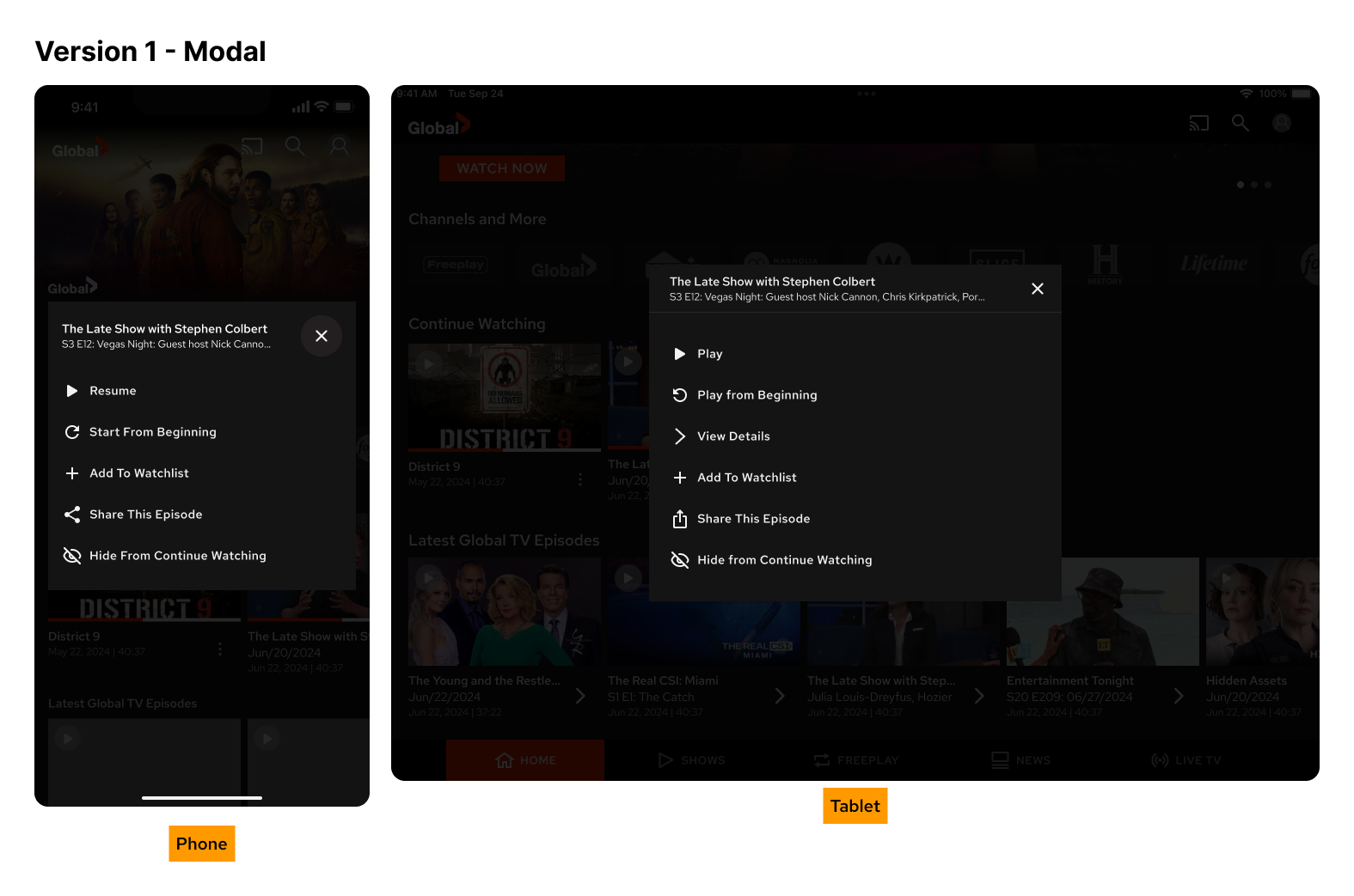
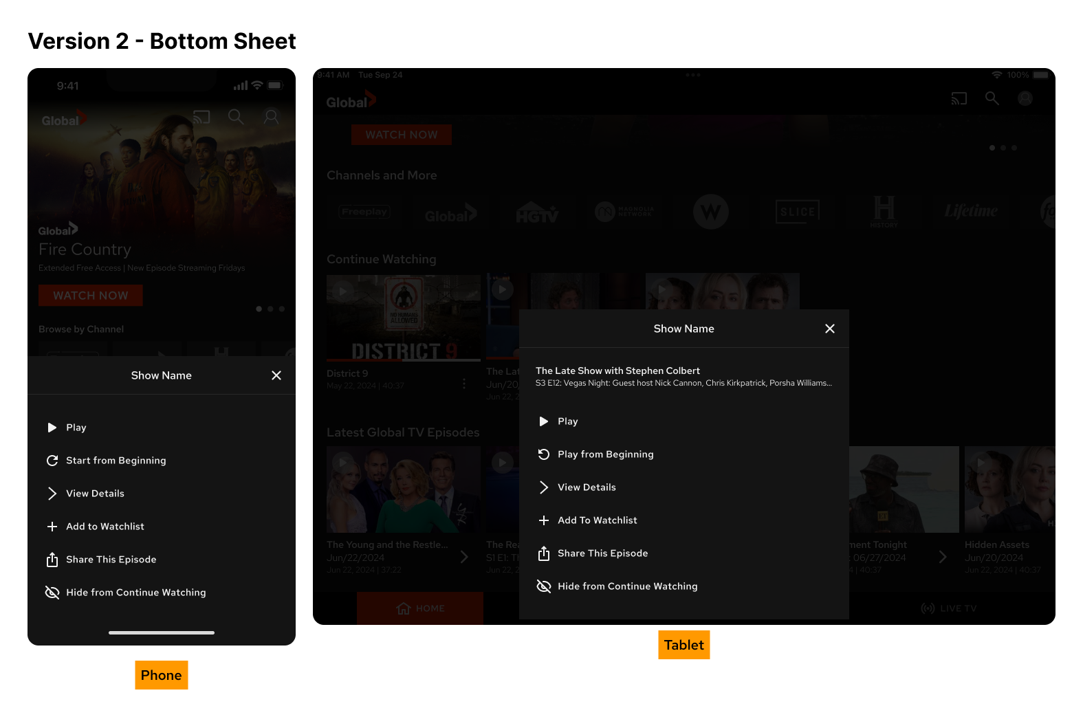
Bottom sheet triggered by tapping the title: matched existing app conventions and offered a flexible layout for future actions
The bottom sheet was the right call for phones. On tablets, the same approach felt spatially weak given the larger screen and limited initial action set, so I used a centred modal overlay instead, following native platform conventions for each form factor.
To set the feature up for future iteration, I also mocked up additional actions beyond the initial scope, including “Start from Beginning,” “Add to Watchlist,” and “Share This Episode,” so the interaction model was extensible without requiring a redesign later.
Design Decisions
Bottom sheet (phone) / modal overlay (tablet): Platform-appropriate patterns that matched existing app conventions and reduced cognitive load
Clear, direct action labels: Play, View Details, Remove from Continue Watching, with no ambiguity about what each action does
Confirmation step for removal: Prevented accidental deletions without adding meaningful friction to the flow
Component reuse from the Figma library: Kept implementation straightforward and maintained visual consistency across the app
Extensible layout: Designed with future actions in mind, so expanding the sheet later requires no structural changes
Outcome
The feature shipped in the next app update. Users went from a single destructive action (clear all history) to a targeted, single-tap removal, eliminating the all-or-nothing friction that had previously made list management impractical for most people.
Beyond the feature itself, the bottom sheet interaction pattern was adopted in two other areas of the app, including show metadata display, demonstrating that designing for reuse from the start pays off in reduced design and development cycles downstream.
Reflection
This project is a good example of how competitive research can function as a form of behavioural validation. Because the interaction model already existed in apps users knew well, we could move quickly into execution without extended discovery, and the internal review process confirmed there were no usability concerns to resolve.
Designing for extensibility from day one also proved valuable. The bottom sheet layout was built to grow, and it did, being reused in contexts we didn’t anticipate at the start of the project. That kind of forward-thinking is what separates a feature from a system.