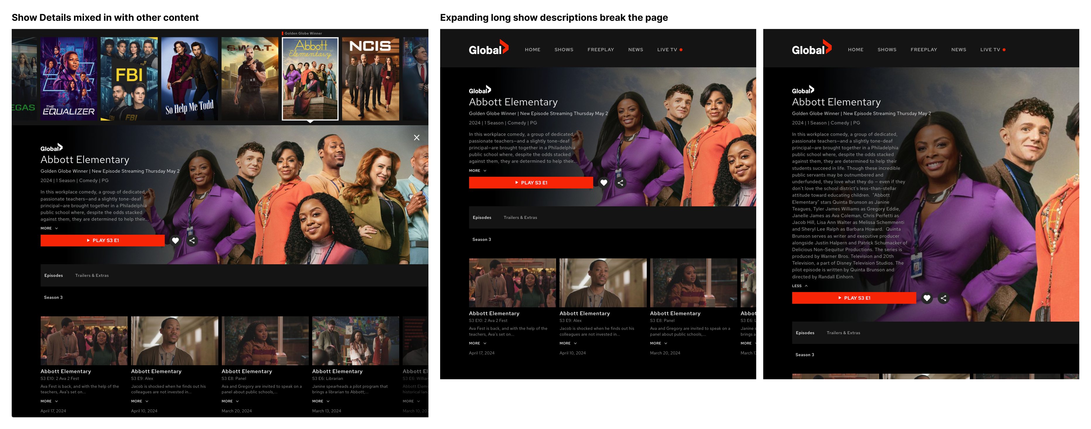
The Show Detail page on the Global TV desktop site did not provide users with enough information to confidently decide what to watch. Key metadata like cast and director were missing entirely, and episodes were buried in a horizontal scroll that made longer seasons tedious to browse. The page also lacked focus, competing visually with surrounding content rather than helping users evaluate the show in front of them.
I led the redesign to create a clearer, more purposeful Show Detail experience. Research conducted through moderated user interviews directly changed the design direction, and the final solution introduced a metadata modal and a grid-based episode layout that reduced the number of interactions required to evaluate and browse content. The work was fully documented and validated, ready for development pickup without additional discovery.
How might we help users discover and evaluate new shows more easily by surfacing relevant metadata and improving the way episodes are browsed?
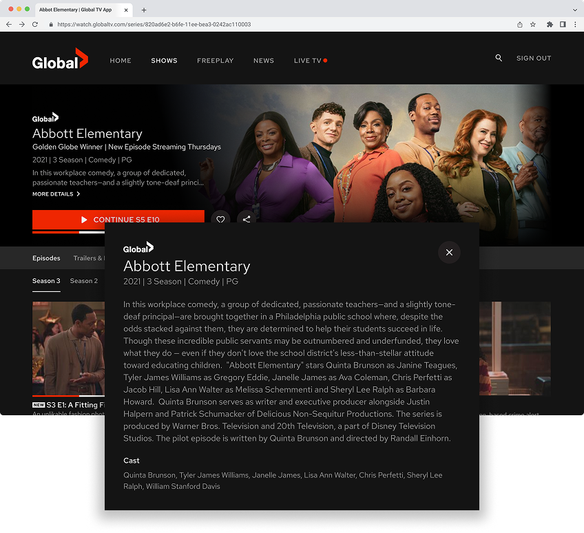
The original page left users without the context they needed to make a confident viewing decision. Genre and description were present, but cast, director, and other key details were absent. Episodes were arranged in a horizontal scroll, requiring repeated swipes to scan through longer seasons. And because the page shared visual space with other site content, it lacked the focused feel users expect when evaluating a specific show.
These were not just aesthetic issues. They were friction points in the content discovery flow, the moment where a user decides to watch or moves on.
My Role
I led the design work for the desktop Show Detail page, from competitive research through final specifications and handoff.
Key contributions:
Conducted a competitive analysis across seven platforms, including Apple TV, Netflix, Disney+, Crave, CBC Gem, Prime Video, and Tubi
Explored three design directions and iterated based on team feedback and user research findings
Partnered with the UX researcher to include the prototype in a scheduled round of moderated user interviews
Used research insights to directly change the design direction, replacing a tabbed layout with a modal after users failed to notice content changes between tabs
Built final high-fidelity designs and specifications in Figma, linked to Jira tickets for developer handoff
Process & Exploration
Research and Behavioral Insights
Design work began before formal research was scheduled, but I was able to include the prototype in an upcoming round of moderated user interviews. While those sessions were not focused on the Show Detail page, the UX researcher added it at the end of each session.
One finding stood out clearly: users did not notice that content had changed when switching between tabs. The tabbed layout I had designed looked visually clean, but it did not clearly communicate the shift in information. That insight directly shaped the next direction. Rather than iterating within the tab structure, I moved to a modal approach that made the transition explicit and intentional.
This is a good example of how even lightweight research integration can meaningfully change a design. The sessions were not planned around this feature, but the signal was clear enough to act on.
Ideation & Concepts
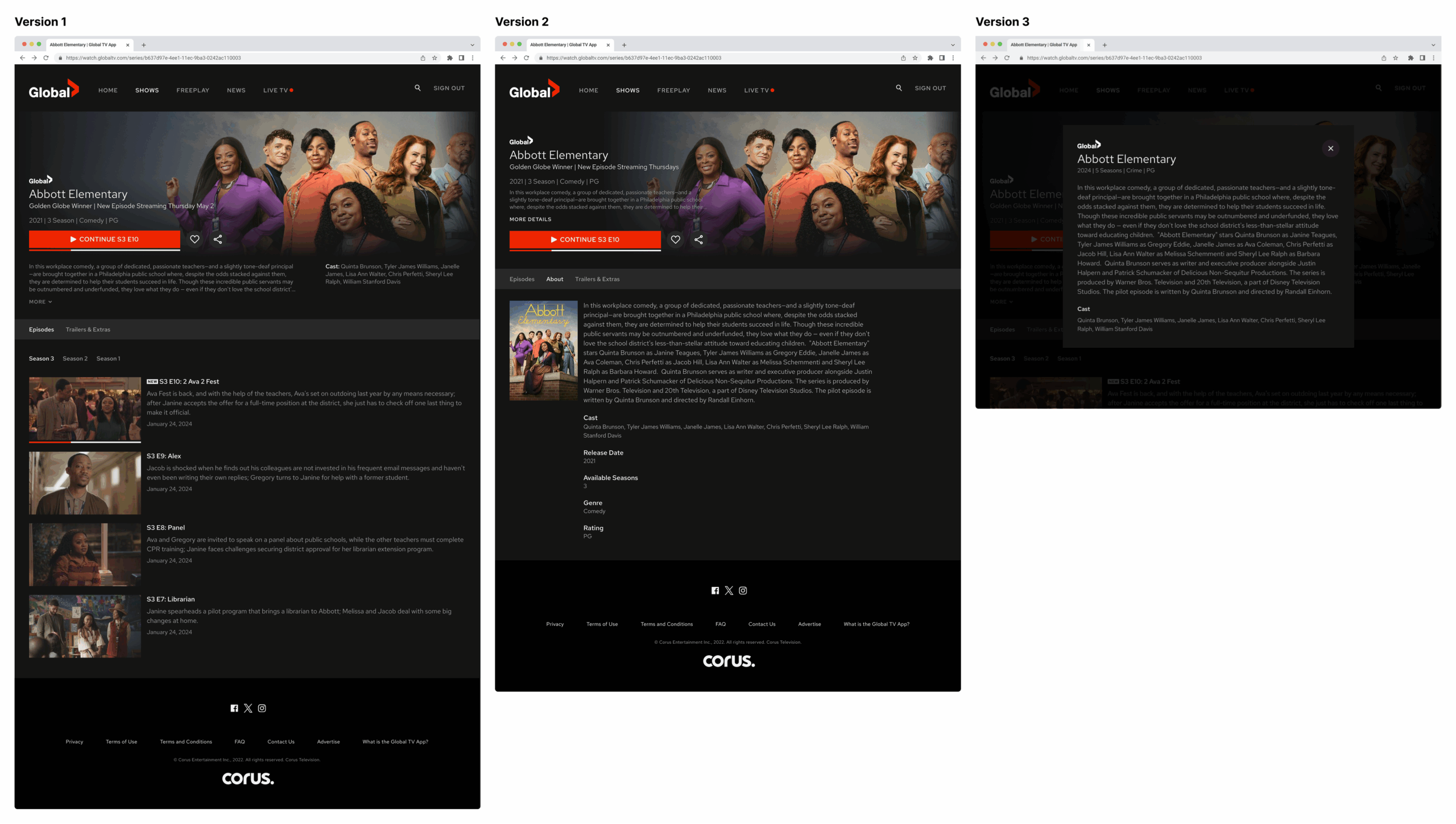
I explored three main directions:
Version 1 surfaced everything, including description, cast, and all episodes, on a single screen. It felt dense and overwhelming, so we moved on quickly.
Version 2 used a tabbed layout to reduce visual clutter. It looked cleaner, but user sessions revealed that tab switching was not intuitive enough, causing users to miss important information.
Version 3 introduced a “More Details” modal that kept the main page simple and gave users a clear, deliberate path to full metadata when they wanted it.
Version 3 became the foundation for the final design.
Design Decisions
Dedicated show page Moving the Show Detail view to a standalone page rather than keeping it embedded in the homepage flow created a more focused experience and reduced visual competition with surrounding content.
Metadata modal Placing cast, director, release date, number of seasons, genre, rating, and full description inside a modal kept the main layout clean while making all the information accessible. The “More Details” trigger was clear and intentional, resolving the confusion the tabbed layout had created.
Episode grid Replacing the horizontal scroll with a three-column vertical grid made it possible to scan an entire season at a glance, significantly reducing the interactions needed to browse long episode lists.
Responsive foundation Although the primary focus was desktop, the layout was designed to scale to other screen sizes with minimal rework.
Outcome
The final designs were research-validated, fully documented, and added to the development backlog in a state that required no additional discovery before implementation. The two core changes addressed the primary friction points directly: users could now access full show metadata without hunting for it, and episode browsing no longer required repeated horizontal scrolling through long seasons.
The process also demonstrated the value of integrating research opportunistically. A finding from sessions that were not designed around this feature directly improved the design and prevented a suboptimal tabbed layout from shipping.
This project was a reminder not to lock in a direction too early. The tabbed layout felt like a reasonable solution before research, and it might have shipped that way without the user sessions. The willingness to change direction in response to a clear signal, even partway through the process, led to a stronger outcome.
It also reinforced that research does not always require a dedicated study. Finding a way to include the prototype in already-scheduled sessions added real insight without adding significant overhead. That kind of pragmatic integration is something I look for on every project.