When I joined Tier1 Financial Solutions, the product suite serving investment banking and capital markets professionals had grown across multiple tools without a shared design foundation. Each product had its own visual language, spacing conventions, and interaction patterns. The result was a fragmented experience that was harder for users to learn, slower for engineers to build, and difficult to maintain as the product evolved.
I was brought in specifically to lead the design system initiative for Tier1’s desktop products on the Salesforce platform. My role was to create a unified component library and documentation framework that would bring consistency across the suite. The system contributed to a reduction of approximately 35% in the steps required to complete key tasks through clearer UI patterns and consolidated navigation, and helped reduce errors in compliance-sensitive workflows by an estimated 15% by restructuring layouts and improving information hierarchy.
The Problem
How might we create a consistent, scalable design foundation across Tier1’s desktop products that reduces friction for users and improves delivery speed for the team?
Tier1’s platform covered a wide surface area: CRM workflows, deal management, interaction logging, compliance tracking, and corporate access tools, all built on Salesforce for desktop. Each area had evolved independently, and the inconsistencies were visible at every level.
Navigation patterns differed between products. Filter components looked similar but behaved differently. Spacing was applied inconsistently. There were no shared colour or typography styles to enforce visual alignment across teams.
For high-frequency users such as investment analysts and sales professionals completing dozens of interactions each day, these inconsistencies created real friction. For engineering teams building new features, the absence of a shared component reference meant starting from scratch each time, adding unnecessary rework to every delivery cycle.
My Role
I led the design system initiative end-to-end. This meant auditing the existing UI across Tier1’s Salesforce-based desktop products, building a structured component library in Figma, and creating InVision prototypes with detailed annotations that served as the handoff reference for engineering.
Key contributions:
Audited UI patterns across Tier1’s desktop product suite to identify inconsistencies and redundancies
Built a component library in Figma using master components and shared styles, covering navigation, toolbars, filter controls, forms, and data display patterns
Established colour and typography styles in Figma as the shared visual foundation
Created annotated InVision prototypes to document interaction behaviour, component states, and usage guidelines for engineering teams
Developed spacing and grid documentation with precise pixel values to ensure implementation accuracy
Worked alongside developers to validate that components reflected real Salesforce platform constraints
Cross-referenced sister products within the Tier1 suite to ensure navigation and interaction patterns stayed consistent across tools
Process and Exploration
Audit and Migration
The first step was understanding the full scope of what existed. I reviewed navigation bars, toolbars, filter controls, and data grid patterns across the product suite to identify what was inconsistent, duplicated, or simply missing.
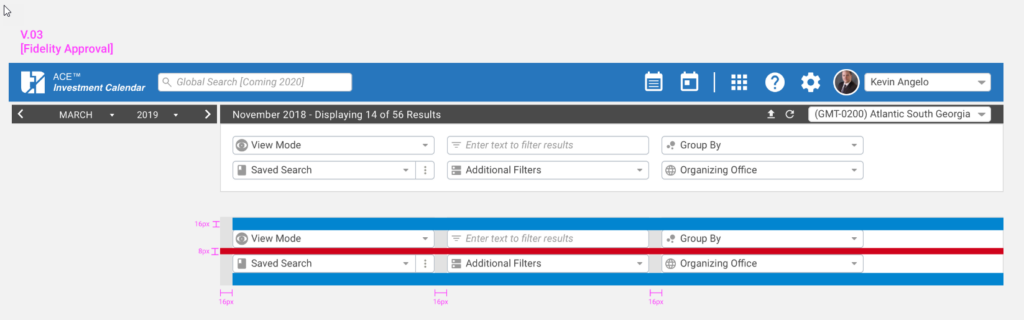
One area that needed particular attention was the filter toolbar used across multiple products, including the ACE Investment Calendar. The same component appeared in different forms depending on which part of the platform a user was in, with inconsistent spacing, labelling, and behaviour. Standardizing this component alone had a meaningful impact on usability for high-frequency users who relied on filtering to manage large data sets every day.
Documentation Standards
With Figma’s capabilities at the time focused on master components and shared styles rather than variants or tokens, the system was built around a library of individual master components with clearly named states, combined with InVision as the documentation and prototype layer.Each component was accompanied by annotated InVision screens that explained spacing rules, colour values, and interaction behaviour in plain language. This meant engineering teams received a precise technical reference alongside the visual design, not just a static mockup to interpret on their own.
Spacing was documented with explicit pixel values directly on the InVision screens. This level of specificity was deliberate. In a compliance-regulated environment where implementation accuracy mattered, reducing ambiguity in the handoff was as important as the design itself.
Filter toolbar specifications showing 16px and 8px spacing annotations, V.03 at Fidelity Approval stage
Component States
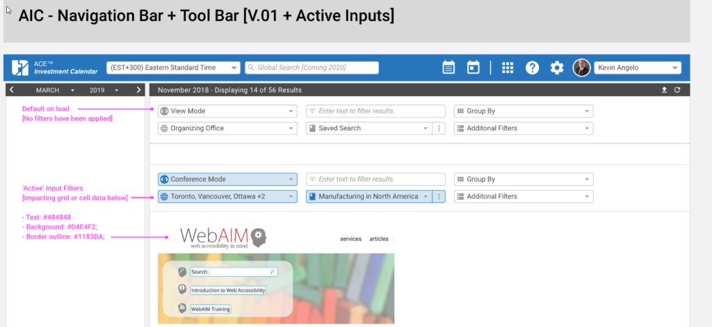
One of the most important things the system needed to establish was a clear and consistent visual language for component states. Users on Tier1’s platform worked with filtered data views constantly, and it was critical that the interface clearly communicated when a filter was active and affecting the data displayed, versus when it was in a neutral default state.
For each filterable component, I documented two states: a default load state with no filters applied, and an active state where a filter selection was impacting the grid or cell data below. Each state was specified with explicit colour values, including text colour, background, and border, so developers had no ambiguity.
Navigation bar and toolbar showing default state versus active input filter state, with colour tokens documented
Cross-Product Consistency
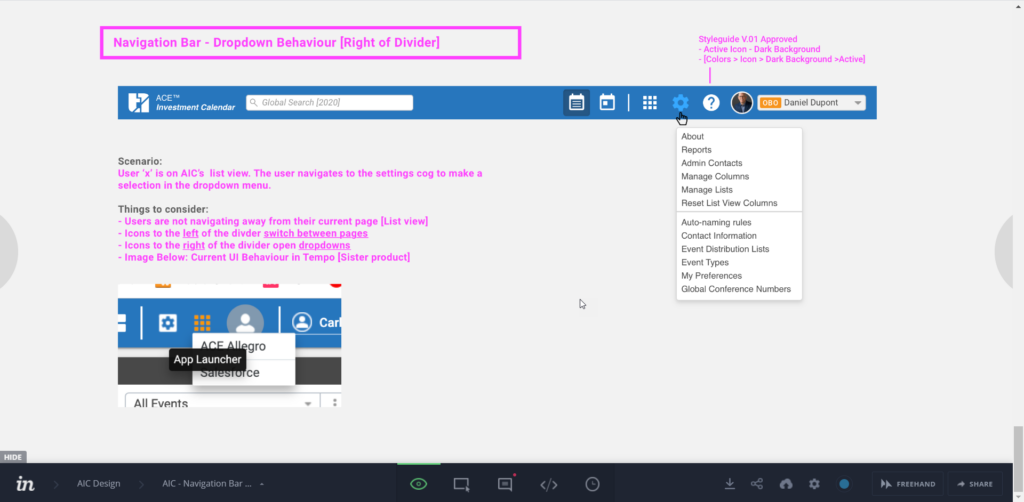
Tier1’s product suite included multiple tools that users moved between regularly. Where navigation behaviour or interaction patterns needed to align across products, I documented the rationale and cross-referenced how the same pattern was handled in sister products.
A clear example was the navigation bar divider convention. Icons to the left of the divider switched between pages, while icons to the right opened dropdowns within the current view. This distinction was not obvious from the UI alone, so I documented the scenario explicitly in InVision with usage notes and a comparison to the Tempo product to ensure consistency across the suite.
InVision prototype documenting navigation bar dropdown behaviour, with scenario annotations and cross-reference to Tempo product
Outcome
The design system became the shared reference for all desktop feature work across Tier1’s Salesforce-based products. Key outcomes included an estimated 35% reduction in the steps required to complete key tasks through consolidated navigation and clearer UI patterns, and an estimated 15% reduction in errors in compliance-sensitive workflows through improved information hierarchy and layout consistency.
Beyond the metrics, the system changed how the team worked. New components no longer need to be designed from scratch. Handoff conversations became more focused because engineers had a precise reference rather than a visual approximation. And the product began to feel like a single cohesive platform rather than a collection of separately built tools.
Reflection
Design systems in enterprise SaaS are not just about visual consistency. In a regulated financial environment, they are about reducing the cognitive cost of a product that professionals use for hours every day under real pressure. Small inconsistencies in how filters behave, or how navigation responds, accumulate into meaningful friction for people who cannot afford to slow down.
The constraint of working within Figma’s capabilities at the time, without variants or token support, meant leaning more heavily on clear naming, master component discipline, and thorough InVision documentation. That constraint turned out to be a useful discipline: it forced the system to be explicit and well-documented rather than relying on tool features to carry the logic.