Role: Senior Product Designer Platforms: Web (Desktop), iOS, Android, tvOS Team: Solo Designer with Developer Support Tools: Figma, Sketch, Slack
When I joined the team, the Global TV product already had a functional UI across web, mobile, and TV. However, with the company transitioning from Sketch to Figma, I saw an opportunity to create a more efficient and scalable design system that could support multi-platform work in the future.
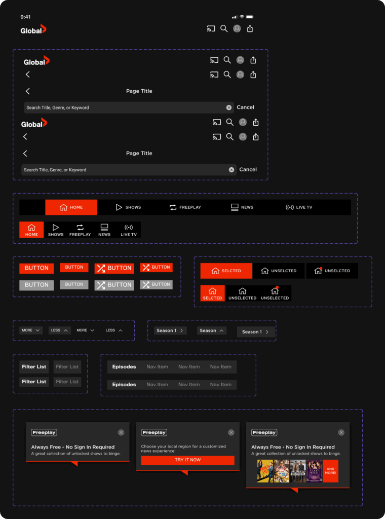
I rebuilt the component library in Figma, organizing it by platform and updating it with modern features such as Auto Layout, component properties, and later, Variables and Design Tokens. While the system was primarily used for my own design workflow, it allowed me to move faster, stay consistent, and collaborate more easily with developers.
This foundational system helped me deliver updates and new feature designs with speed and consistency across platforms, without having to rebuild the wheel each time.
The Problem
The existing design system, which was maintained in Sketch, was becoming increasingly difficult to manage as the Global TV product expanded across desktop, mobile, and TV platforms. Components lacked consistency and weren’t easily reusable, making it difficult to move quickly on new features or UI iterations.
With the company transitioning to Figma, there was an opportunity to modernize how components were managed, bringing better scalability, reuse, and efficiency to our cross-platform design workflow.
My Role
As the Senior Product Designer responsible for the Global TV app across web, iOS, Android, and tvOS, I led the transition of our existing component set into a structured, reusable system in Figma. While the core components already existed, I reorganized and rebuilt them as a usable library.
Over time, I maintained and evolved the system, including a later update that introduced Figma Variables and Design Tokens.
My key contributions:
Converted the design system from Sketch to Figma
Organised libraries by platform, separating mobile, web, and tvOS
Created platform-specific components and variants where needed
Maintained the system solo, consulting with developers and past designers
Updated the system to support Variables and Tokens for future-proofing
Process & Exploration
System Audit & Platform Mapping
I began by importing and organizing the existing Sketch files into Figma. Rather than starting from scratch, I worked through one platform at a time. I identified reusable elements, cleaning up inconsistencies, and defining what needed to be flexible versus fixed.
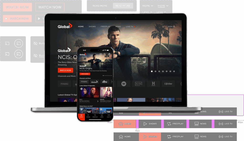
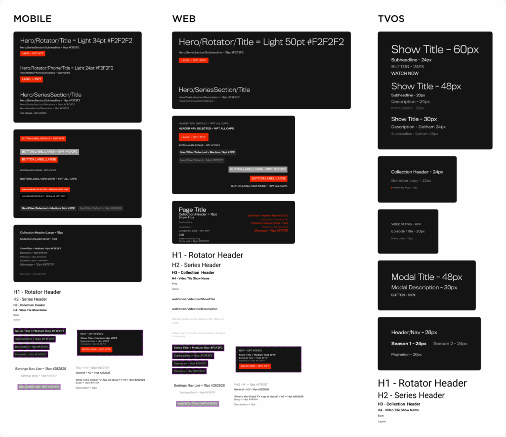
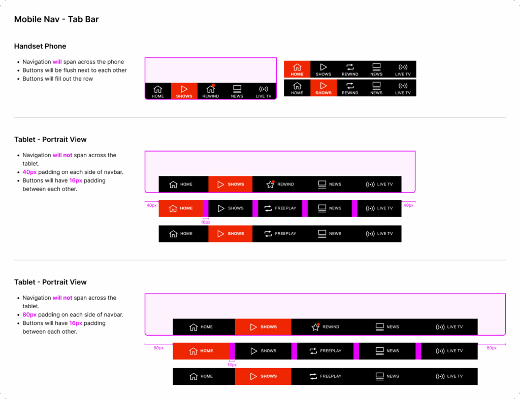
Components for iOS and Android shared a similar look and feel, so I grouped them together. Web had unique layout needs, while tvOS required a separate, simplified library due to its navigation model and input constraints.
This initial phase helped me learn the existing UX while building a system that would save time in future mockups.
Collaboration & Clarification
While I owned the system end-to-end, I wasn’t completely on my own. When building more complex or unfamiliar components, I reached out to developers to understand how things were built on their side. I also connected with the previous designer to clarify legacy patterns.
By working closely with engineers, I ensured component naming and behaviour reflected real-world implementation, which made future design and dev collaboration smoother.
Design Decisions
Library Organisation
Platform-specific structure: Separate libraries for Web, Mobile, and tvOS
Component flexibility: Shared patterns with platform-appropriate variations
Naming conventions: Clear, developer-friendly labels for easier handoff
Leveraging Figma Features
Used Auto Layout and component variants to reduce duplication
Created responsive versions where needed (especially for web)
Maintained a single master file with all core foundations and components
When Figma released support for Variables and Design Tokens, I took time to revisit the system and modernize it. This included:
Colour variables
Typography styles
Spacing scales
Component states (hover, active, disabled)
These improvements helped future-proof the system and made it easier to keep designs consistent, especially across platforms.
Final Design
The updated design system provided:
A single source of truth for UI elements
Platform-specific component variants
Tokens and variables that simplified updates
Faster turnaround when mocking up new features or UI changes
Everything lived in Figma, making it easy to drag and drop components across platforms without rebuilding from scratch.
Outcome
While the design system was primarily built for my workflow, it evolved into an essential toolkit for moving quickly across various platforms. New mockups were more consistent, dev handoff was cleaner, and I could focus more on UX problem-solving instead of redrawing layouts.
Since no major new features were being developed during parts of the system’s build, it wasn’t widely adopted by others. However, it played a crucial role in helping me stay efficient and consistent while managing multiple platforms independently.
Reflection
This project gave me the chance to gain a deep understanding of how Figma can be used not just for static mockups, but as a powerful system design tool. Rebuilding the Sketch library taught me how to think in reusable components, while the later update with Variables pushed me to adopt scalable thinking for tokens and design tokens.
If I had more time, I would have added richer documentation directly in Figma to support team adoption and future onboarding. I also see the opportunity to open up contribution paths for other designers, making the system more collaborative as the team evolves.