Role: Senior Product Designer Platforms: Web (Desktop, Tablet, Mobile Browser) Team: Product Owner, Co-Designers, Web Developer Tools: Figma, Slack
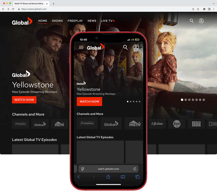
The Global TV website didn’t support mobile or tablet browsers. Users on smaller screens were blocked by a prompt to download the app, with no way to browse or stream content. As mobile traffic increased, this gap became more noticeable—and costly.
I led the responsive redesign to make the website usable across all devices. By adapting mobile app components, introducing a new drawer-style navigation, and building flexible templates in Figma, I created a mobile-first system that worked across phones, tablets, and desktops.
The final designs were thoroughly spec’d and added to the backlog, laying the foundation for a consistent streaming experience across web and mobile.
The Problem
How might we create a mobile-first version of the Global TV web app that supports browsing and playback without requiring users to download the app?
The Global TV website was not viewable on mobile devices. If users visited the site from a phone or tablet, they were blocked by a full-screen message that directed them to download the app. While the desktop version worked, mobile users were completely excluded.
After the mobile apps launched, the web platform was no longer a priority due to limited resources. However, as mobile web usage increased, it became clear that we were missing a significant group of users who did not want to download the app.
My Role
I led the responsive redesign effort for the Global TV web platform. The goal was to make the website functional across all screen sizes, allowing users to browse and stream content without needing to install the app.
In Figma, I:
Reused and adapted design system components from the mobile apps
Created responsive layouts using auto layout, constraints, and variables
Applied design tokens for consistent spacing, typography, and colours
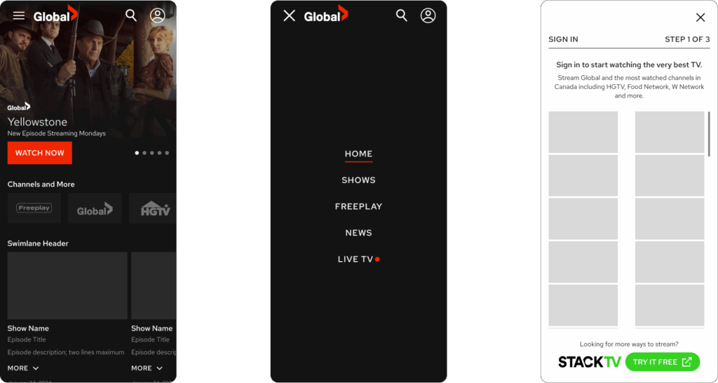
Introduced a new mobile-specific drawer navigation to replace the persistent desktop menu
I collaborated with the product owner and developer to ensure alignment and provided complete documentation before the work was handed off.
Process & Exploration
Ideation and Concepts
I began by mapping standard breakpoints based on common device sizes. Since the desktop site already existed, my focus was on adapting the experience for smaller screens while maintaining a consistent structure.
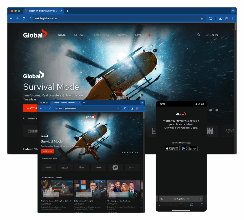
Most components were repurposed from the mobile app to help users transition smoothly between platforms. The most significant change was the mobile navigation. Unlike the app’s tab bar, I implemented a hamburger-style drawer menu that followed expected mobile web conventions and saved screen space.
Design Decisions
To support a flexible and consistent experience across devices, I used the following methods:
Responsive behaviour was built using auto layout, constraints, and variables
Design tokens ensured consistency across colours, spacing, and text styles
I created a working prototype to simulate navigation transitions and page interactions
Tap targets were sized appropriately to meet accessibility requirements
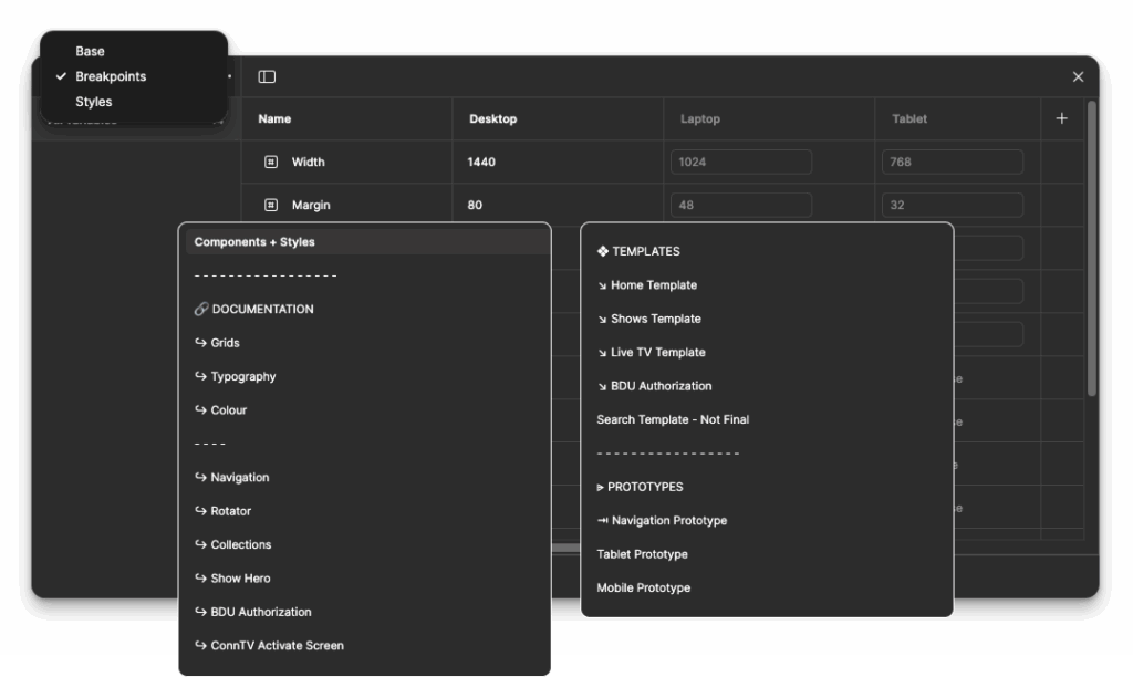
The Figma file included:
Fundamentals: Grids, typography, and colour palette
Components: Navigation, hero banners, tiles, and carousels
Templates: Home, Shows, Live TV, and Account pages
Tablet and phone prototypes were developed to show how layouts adjusted at each breakpoint.
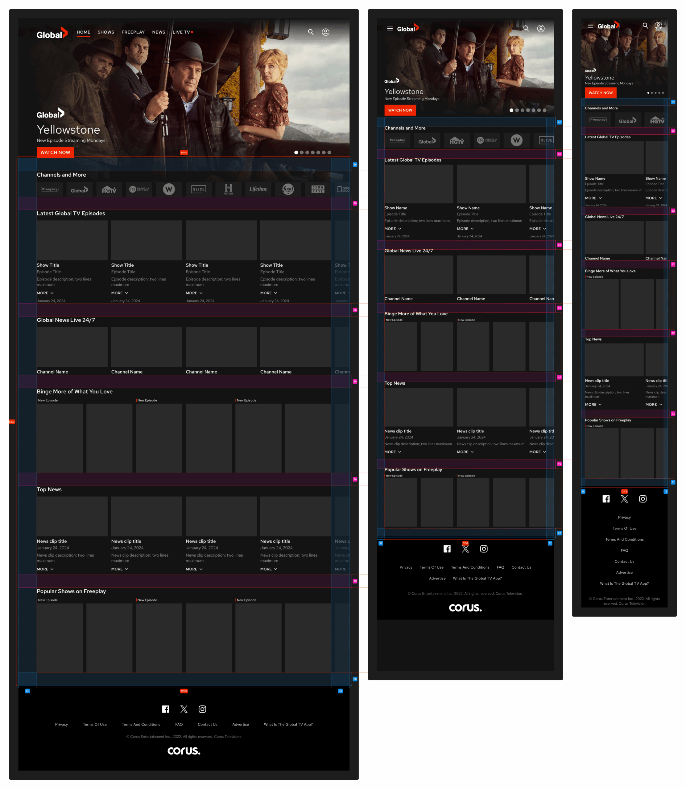
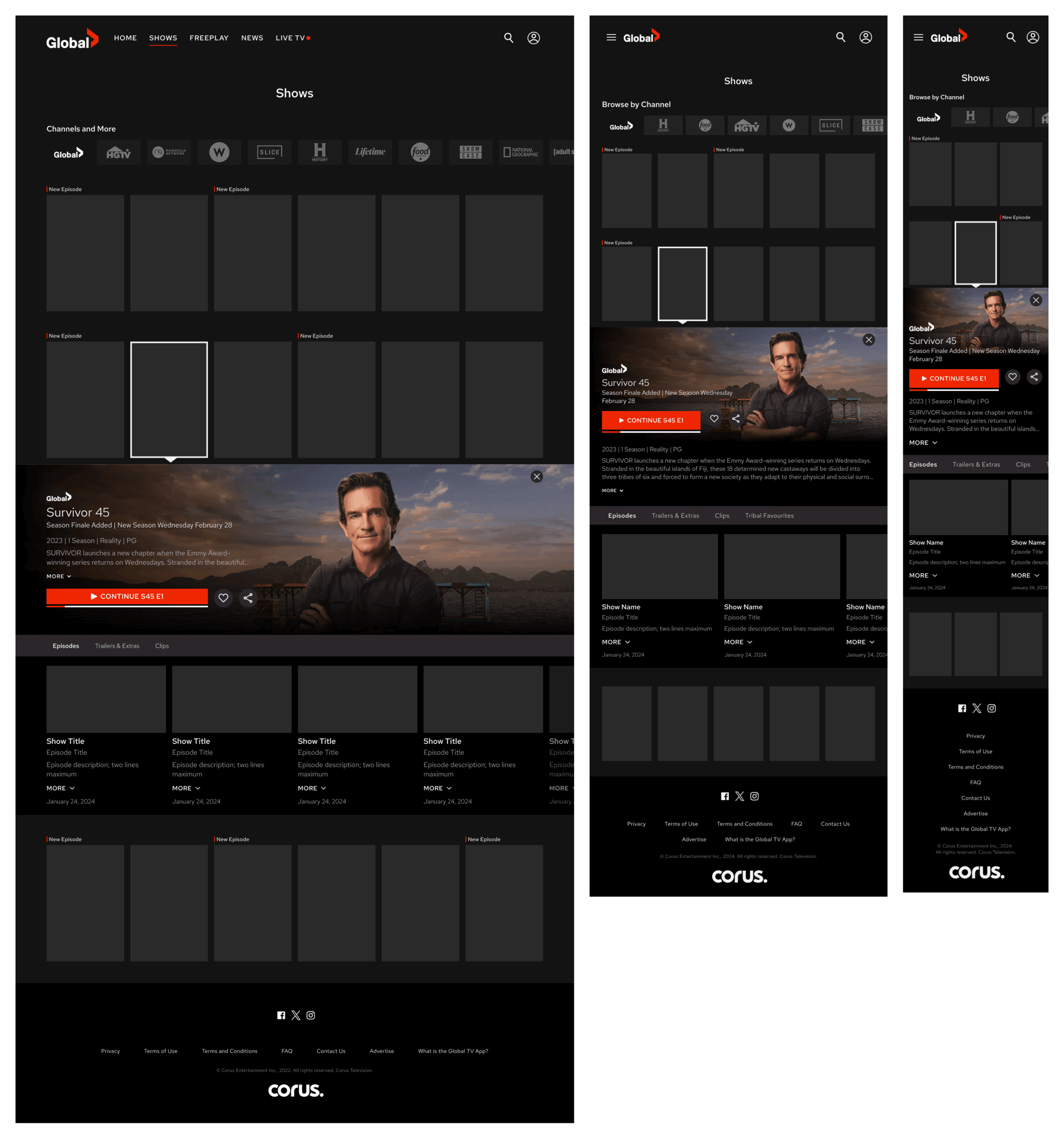
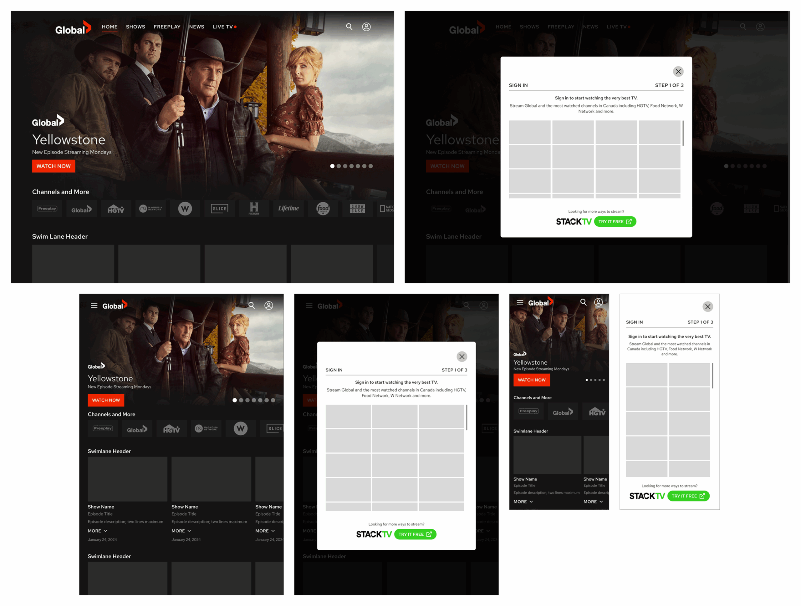
Final Design
The completed prototype captured how users would experience the Global TV website on phones and tablets. Each screen included spec documentation and interaction logic to support developers, QA, and stakeholders during implementation.
Navigation, layout structure, and responsive behaviour were clearly defined across all templates. The drawer menu on mobile allowed users to access key sections without interfering with the content.
Responsive Mockups of Home Screen
Responsive Mockups of Shows
Responsive Mockups for User Sign In
Collaboration & Constraints
Since this redesign introduced a new mobile navigation model, I presented the solution to the team and the product owner. I also worked closely with our web developer to understand technical limitations and discuss how to phase in responsive updates once resourcing became available.
Although the responsive site has not been implemented, all designs and documentation have been added to the backlog for future development.
Outcome
The responsive redesign is fully complete and ready for development. The work remains in the backlog, pending future implementation.
Reflection
This project highlighted the importance of mobile-first thinking when designing web experiences. It also reinforced how design systems and modern Figma tools can help scale work efficiently. Although the redesign has not yet been launched, the groundwork is complete and ready to move forward when the team is ready.