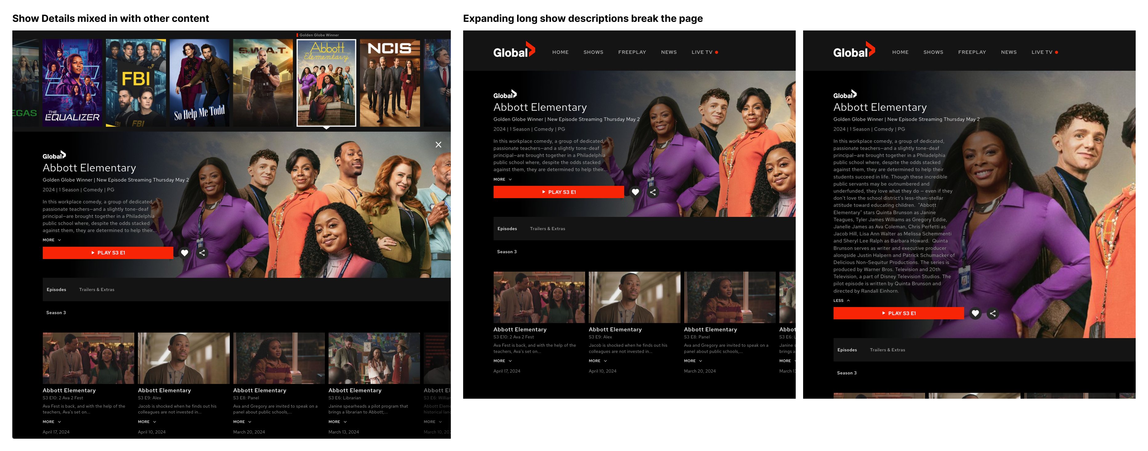
The Show Detail page on desktop didn’t give users enough context to decide what to watch. Key metadata like cast and director information was missing, and episodes were hidden in a horizontal scroll that made browsing difficult. The page also competed with other content, making it hard for users to focus on the show itself.
I led the redesign to create a dedicated Show Detail page that felt clearer and more purposeful. By introducing a new metadata modal and switching to a grid layout for episodes, I helped users get the information they needed without distraction.
The final design was added to the backlog and set the groundwork for a more consistent, focused experience across the streaming platform.
How might we help users discover and evaluate new shows more easily by surfacing relevant metadata and improving the way episodes are browsed?
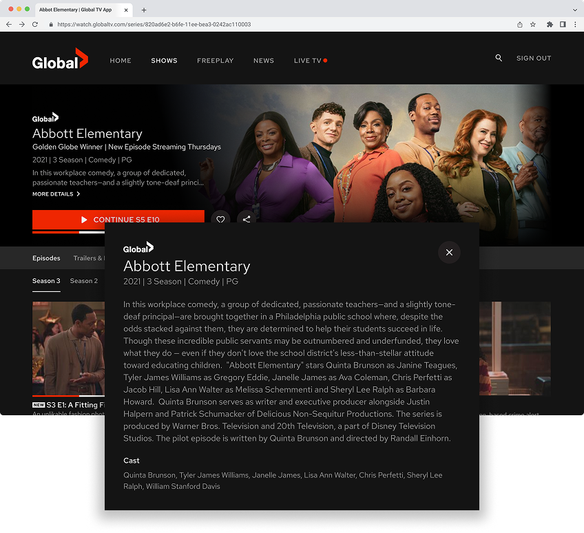
The original experience lacked clarity, making it harder for users to make confident viewing choices. While genre and description were included, other key metadata like the cast was missing. Episodes were placed in a horizontal scroll, which made longer seasons more difficult to scan. These design choices created a missed opportunity to support content discovery and didn’t align with user expectations.
My Role
I led the design work for the desktop Show Detail page update. My goal was to make it easier for users to access helpful information such as cast, description, and episodes, while keeping the layout simple and focused.
To shape the direction, I ran a competitive analysis of Apple TV, Crave, CBC Gem, Disney+, Netflix, Prime Video, and Tubi. I identified recurring patterns and shared my findings with the team. A few of the early questions I raised included:
Should cast details be shown upfront or placed in a secondary view?
How many names should be shown at once?
Could we eventually link cast names to dedicated actor pages?
I explored several concepts and presented them for feedback. Throughout the process, I maintained close contact with our developer and created final specifications in Figma, which were linked to Jira tickets. Although the work didn’t launch during my time at Corus, I ensured it was fully documented to facilitate a smooth handoff.
Process & Exploration
Research & Insights
Research began after several design drafts had already been completed. We had a chance to include the prototype in a scheduled round of moderated user interviews. While these sessions weren’t focused on the Show Detail page, our UX researcher added the design at the end of each session.
One insight that stood out was that some users didn’t notice the content had changed after clicking the “About” tab. This revealed that the tabbed layout wasn’t as clear as I had expected. That feedback helped us shift direction and look for a more intuitive way to display the show’s information.
Ideation & Concepts
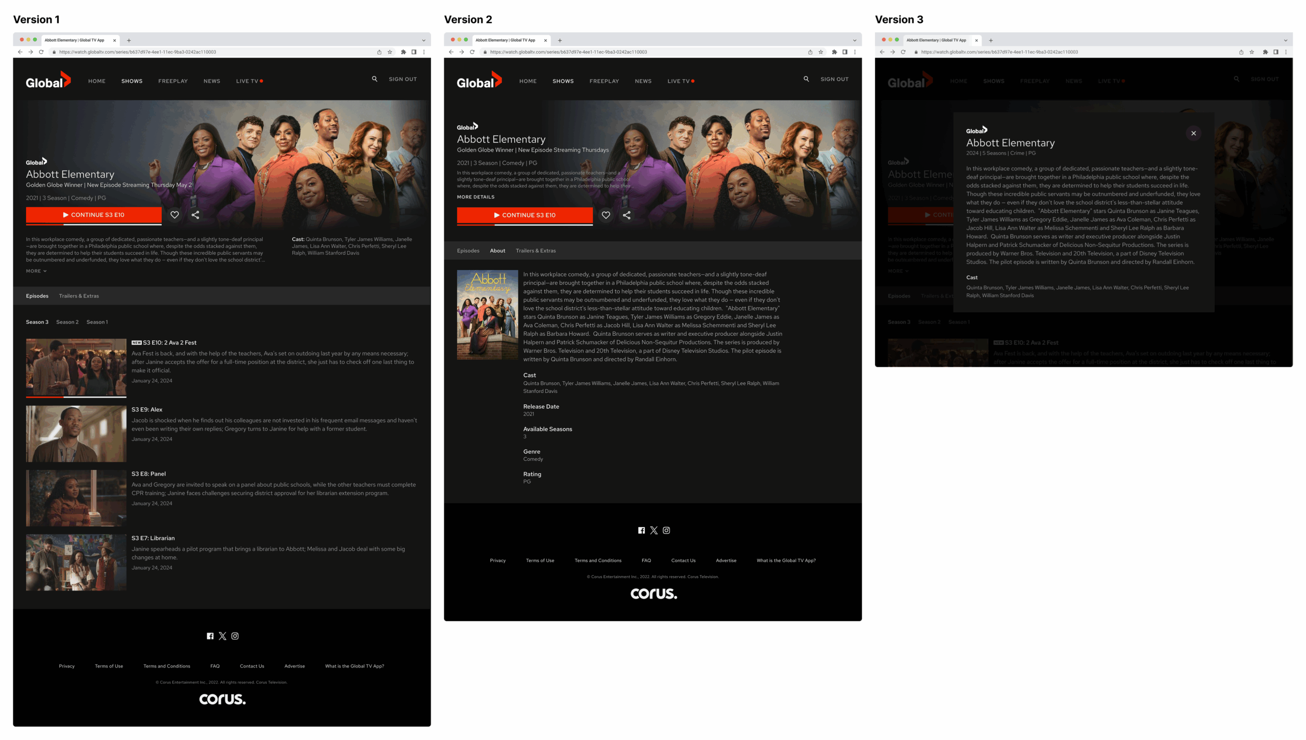
I explored three main directions:
Version 1 showed everything—description, cast, and episodes—on a single screen. It felt crowded and overwhelming, so we moved on quickly.
Version 2 used a tabbed layout to reduce visual clutter. While it looked cleaner, users missed important information when switching tabs.
Version 3 introduced a modal that opened when users clicked “More Details.” This allowed us to maintain a simple main layout while providing users with full access to metadata when needed.
Since the layouts were relatively straightforward, I worked directly in high fidelity using Figma. Low-fidelity wireframes weren’t necessary for this project.
Design Decisions
Dedicated Show Page I moved the Show Detail view to a standalone page, rather than keeping it within the homepage flow. This created a more focused experience, making it easier for users to stay engaged.
Metadata Modal I placed detailed show information, such as cast, director, release date, number of seasons, genre, rating, and full description, inside a modal. It opened when users clicked the “More Details” link beneath the show description.
Episode Grid I replaced the old horizontal scroll with a three-column grid layout. This improvement in scannability, especially for shows with longer seasons, is notable.
Responsive Layout While this work focused on the desktop, I designed the layout to scale easily to other screen sizes.
Final Design
The updated layout focused on simplicity and clarity. Two key changes made a noticeable difference. First, all detailed metadata was placed in a modal, keeping the main layout clean. Second, episodes were organized in a vertical three-column grid, making it easier to scan through long seasons without side-scrolling.
This version was included in moderated user interviews, and I created a more refined prototype based on the feedback we received.
I designed with development limitations in mind. Since this was a significant change to the Show Detail experience, I considered which parts could be implemented quickly and which might require more time.
Although development resources were limited and the project was placed in the backlog, I made sure everything was ready for future handoff. I kept our developer informed and provided clear documentation throughout the process. We didn’t reach the build phase before I left.
Outcome
The final designs were completed and added to the backlog. Although they weren’t implemented during my time at Corus, they gave the team a clear and practical direction for improving content discovery and episode browsing on desktop.
Reflection
This project reminded me not to limit my thinking too early. Initially, I focused on what would be easiest to build, which led to safer but less effective ideas. Once I allowed myself to explore more freely, the design improved significantly. Constraints are important to understand, but they shouldn’t restrict creativity in the early stages of a project.